Colours for the bedroom: how to combine them and which ones to avoid?
6 minutes of reading
19
Sep
Colours play an important role in psychology. Some affect you positively, others negatively. Especially in the bedroom, the colour scheme needs to be carefully considered. The colours you choose can help you fall asleep better, wake up smiling or, on the contrary, cause you to sleep restlessly. What colours to choose for the bedroom?
This is how designers combine colours
Before you choose specific colours, you need to know how to match them together to create a harmonious whole rather than colour chaos. You can adapt your choice of colours to current trends, but it’s better to bet on personal taste. At the same time, you need to keep in mind what emotions colours evoke. In the bedroom you should feel calm, harmony and balance.
Designers follow the tried and tested 60-30-10 rule when combining colours. It’s a simple decor principle that helps you create an optimal and pleasing palette of colours that work together in a space.
60 – 60% belong to the dominant colour. This is the main colour of the room, which is also called the background colour. It is recommended to choose light, neutral or pastel tones. It should appear on the walls and floor.
30-30% should be a secondary colour that complements the main colour. At the same time, however, it should be sufficiently different from it. It should be about half the amount of the main colour. It belongs on curtains and larger pieces of furniture, such as beds.
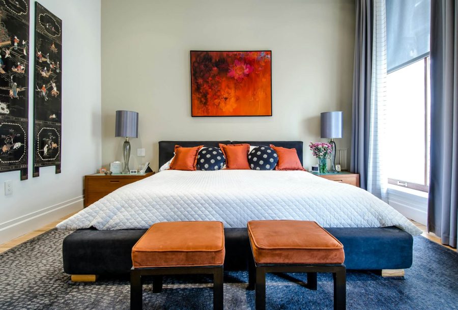
10 – 10% should be devoted to the complementary colour. It is a playful element that occupies only 10% of the interior. Because of its small amount, you can choose a bolder colour. It should appear on home textiles, bedding, artwork and decorations in general.
Optical and sensory effects of colours and patterns
Colours are a great tool of optics. You can use them to make your bedroom bigger, smaller, wider or higher.
Light colours make the room visually larger and brighter. It is especially suitable for small bedrooms.
Dark colours make the bedroom smaller and cosier. They find their place in large and bright bedrooms. Dark colours should be used sparingly so that the room doesn’t feel like a cave.
Vertical pattern – if you opt for vertical stripes or other patterns that run from the bottom to the top, you will visually make the bedroom look bigger.
Horizontal pattern – if you want to expand your bedroom, go for horizontal patterns.
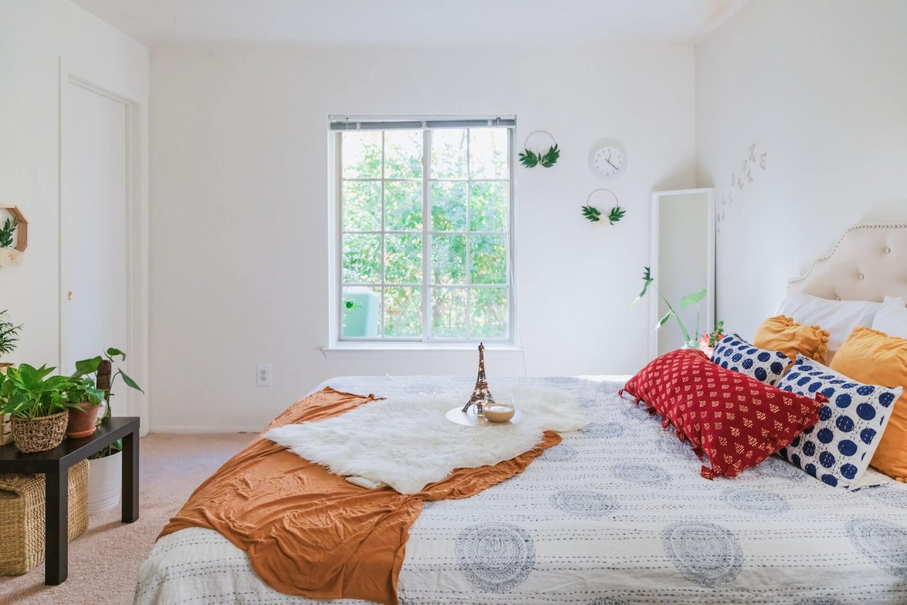
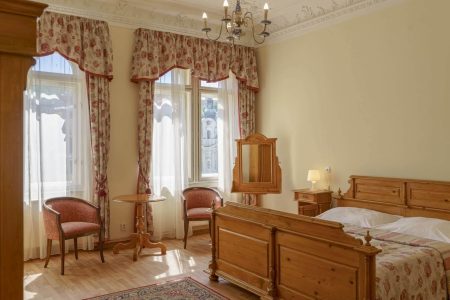
Image: the horizontal pattern expands the room.
The choice of colours in the bedroom should also be adapted to the orientation to the cardinal directions.
Warm colours – if you have a north-facing bedroom, it’s cooler and darker. So choose from a palette of warm colours including yellow, orange and red. They should be in pastel shades. They will evoke sunshine, summer and warmth in the bedroom.
Cold colours – the south side needs a bit of a cool down. Cool colours like green, blue and purple find a place in this bedroom. Again, in pastel shades. The colours make the room feel cooler, and evoke cleanliness and freshness.
Trendy colors for the bedroom of 2022
The right colour for the bedroom is one that evokes a feeling of happiness, well-being and security. It is always worth remembering that it is better to avoid garish colours, and choose pastel or muted shades.
The color trends for the bedroom for 2022 are as follows:
Blue – evokes peace and security. It evokes serenity and a sense of confidence. In the bedroom, blue should appear in light shades.
Green – it is suitable for all those who have trouble falling asleep. It is associated with nature, which has a calming effect. Mint or sage shades of green are best for the bedroom.
Light pink – is for people who live hectic lives. It will look best in the bedroom in the form of decorations and bedding. This color can break down all negative feelings.
White – evokes peace, hope and serenity. It is associated with purity, it can visually enlarge and brighten the room. There shouldn’t be too much white so that the bedroom doesn’t look like a hospital.
Silver – everyone who wants something original will love it. In an environment where this color dominates, people sleep long and undisturbed. It can appear on wallpaper, accessories and bed linen.
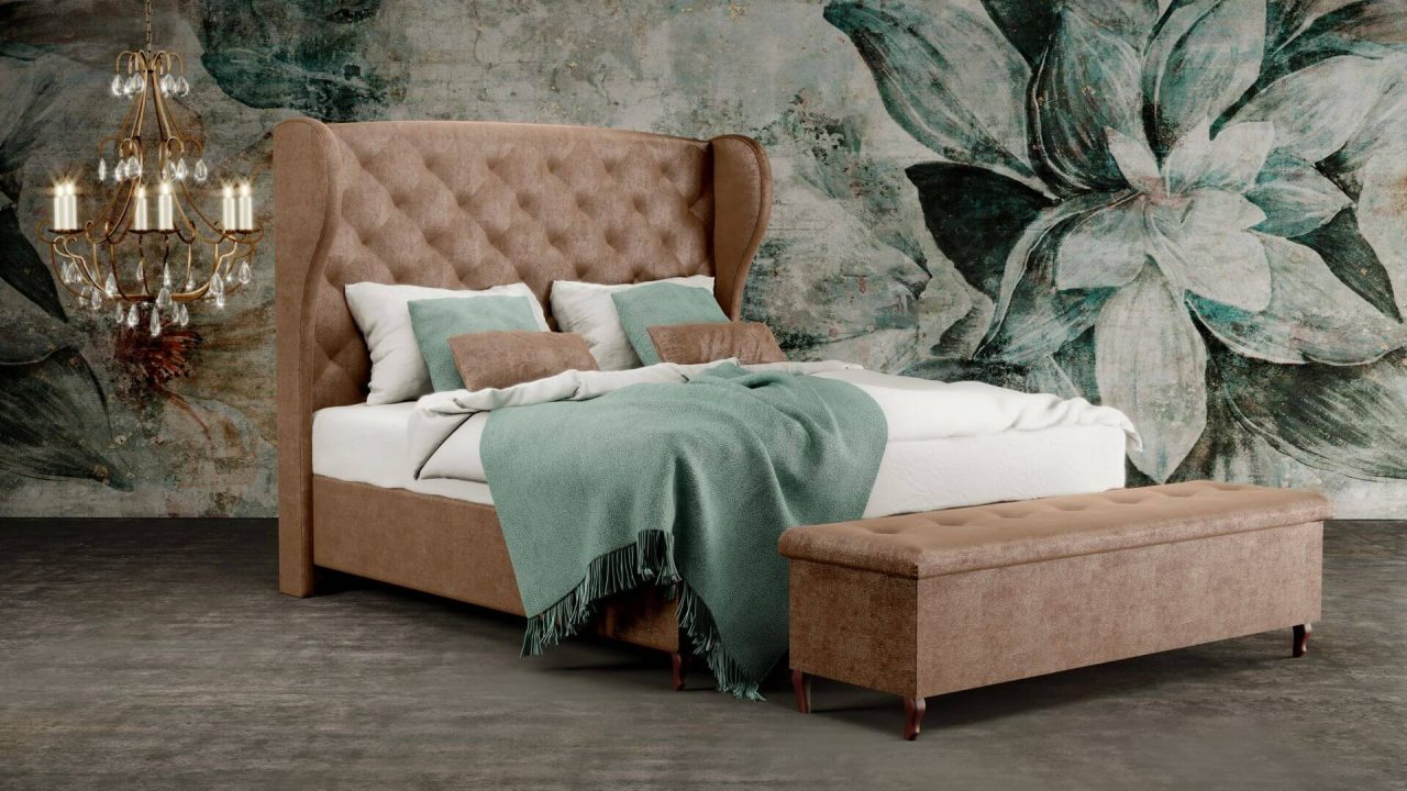
Beige – the best colour for the bedroom according to Chinese feng shui teachings. It is a pleasant neutral shade that is warmer and more personal than white. It has a calming effect and makes the room feel cosy.
Gray – gray color in the bedroom looks calm and elegant. It belongs to the group of neutral colours that require a combination with other colours. If there is too much grey, the bedroom will become a mouse den that will make you feel hopeless.
Image: white colour combines well with other colours.
What colours do not belong in the bedroom?
There are several colours that have a negative effect and disrupt peaceful sleep. Which colours should not appear in the bedroom?
Red – is aggressive, arouses anger and promotes brain activity.
Dark purple – pulsates with energy and promotes creativity. In the bedroom, it brings too vivid dreams and nightmares.
Dark brown – arouses depressive feelings and shortens sleep.
Black – although elegant, evokes feelings of sadness, anger and fear. It can only be used on smaller accessories.
Orange – looks similar to red. It energises you, radiates enthusiasm and will definitely keep you awake.
Colours on walls, furniture and accessories
When choosing colours, divide your bedroom into 3 groups:
walls and floor,
furniture,
accessories.
The colours in all groups should match each other. For bedrooms, it is best to choose tone-on-tone tuning, i.e. shades of the chosen colour. The walls and floor are the largest areas and therefore deserve a neutral colour. Another color will appear on large pieces of furniture such as cabinets, bed or chairs.
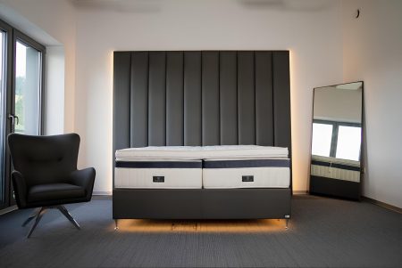
Beds in Materasso we produce customizedso that you can choose the colour of the frame upholstery as well as the headboard. The choice of the design of the legs is also yours. We have a wide range of colours to choose from, but also upholstery material structures, so you can easily match the bed to the overall concept of the bedroom. Our beds can be seen in retailers all over the Czech Republic.
Accessories may be in a distinctive colour. Once you get tired of it, simply replace it. Accessories include:
linens,
decorative cushions,
images,
vases, picture frames, piece carpets, etc.
Colours of the bed linen in relation to the decoration
Bedding is a striking accessory in the bedroom, so when choosing colours you should think about the dominant colour that appears on the walls:
A bedroom in vanilla or apricot will get on well with bedding in the warmer and more autumnal shades of yellow.
For a white-painted bedroom, you can choose bed linen in warm red combined with salmon and chocolate brown. Bed linen in a bold blue is also a good choice.
The apricot paintwork is matched by the brown and beige bed linen, which warms up the room and gives it expression.
The grey tones with wooden elements combine perfectly with the soft purple colour of the bed linen.
In a bedroom in light yellow or beige, bed linen in green tones will look great.
Do not underestimate the choice of colours in the bedroom. The right colour combination can bring you peace, tranquillity and a restful sleep. However, colours that are too bold and energetic won’t let you sleep.
Abychom poskytli co nejlepší služby, používáme k ukládání a/nebo přístupu k informacím o zařízení, technologie jako jsou soubory cookies. Souhlas s těmito technologiemi nám umožní zpracovávat údaje, jako je chování při procházení nebo jedinečná ID na tomto webu. Nesouhlas nebo odvolání souhlasu může nepříznivě ovlivnit určité vlastnosti a funkce.
Funkční
Always active
Technické uložení nebo přístup je nezbytně nutný pro legitimní účel umožnění použití konkrétní služby, kterou si odběratel nebo uživatel výslovně vyžádal, nebo pouze za účelem provedení přenosu sdělení prostřednictvím sítě elektronických komunikací.
Předvolby
Technické uložení nebo přístup je nezbytný pro legitimní účel ukládání preferencí, které nejsou požadovány odběratelem nebo uživatelem.
Statistiky
Technické uložení nebo přístup, který se používá výhradně pro statistické účely.Technické uložení nebo přístup, který se používá výhradně pro anonymní statistické účely. Bez předvolání, dobrovolného plnění ze strany vašeho Poskytovatele internetových služeb nebo dalších záznamů od třetí strany nelze informace, uložené nebo získané pouze pro tento účel, obvykle použít k vaší identifikaci.
Marketing
Technické uložení nebo přístup je nutný k vytvoření uživatelských profilů za účelem zasílání reklamy nebo sledování uživatele na webových stránkách nebo několika webových stránkách pro podobné marketingové účely.